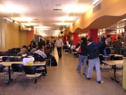
Inspired by Zack Abrams’ diatribe on chairs last year, internal Editor Zoe Sottile takes on another Columbia design flaw: the dining halls.
#1 Dining Experience, if your “experience” is hell.
JJ’s: So weirdly constructed! All of the lines go into weird places! Why is there so much space in the actual dining hall and so little space in the food-making area? All you end up with is an insane line for mozzarella sticks that extends into the hallway towards the seating area, and then that hallway gets so congested you end up half-grinding against the guy your roommate hooked up with freshman year in an attempt to sneak by and get some froyo. JJ’s is either a hollow liminal space or so crowded it becomes a labyrinth of sweet sweaty bodies.
Diana: The lines for Diana are unnecessarily confusing. Who is waiting for a smoothie? Who is waiting for pizza? I do not know! I will never know!
John Jay: In terms of the actual dining hall, I’d say John Jay is actually one of the most efficiently designed. It’s fairly easy to move from, say, the pasta bar to the vegan paste station. But sitting in John Jay? Dragging chairs around so all your friends can sit at the table? Being forced to sit on a window ledge because there are never enough freaking seats? John Jay is seating hell.
Ferris: Ferris was literally designed for maybe four people, max.
Hewitt: A friend of mine once described Hewitt both as “a strange mix of all the dining halls” and “a place where you go when you don’t want to be seen”. Take from that what you will.
Image via Wikimedia Commons.


 1 Comments

1 Comment
@Anonymous Dumb. Columbia’s dining halls are actually very nice.