OK, maybe not “quick,” but hopefully interesting.
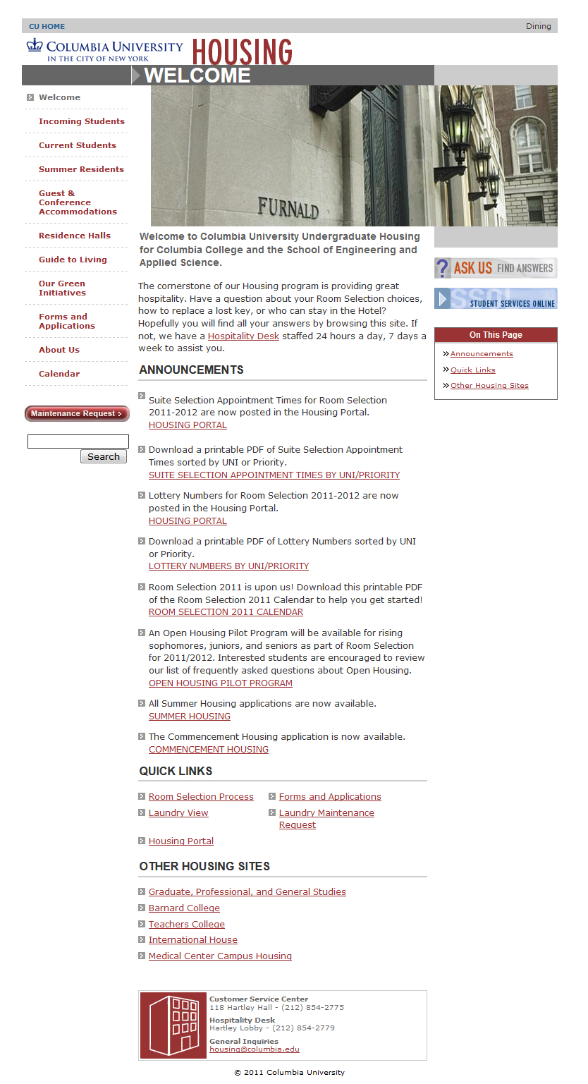
Here is the Columbia Housing website, as it existed in 2011.

Personally, I love the way this looks, in a nostalgia-y kind of way. A few notes:
- There’s white space abound, but it doesn’t look like it was planned for.
- See the tall red text that says “HOUSING”? That’s a JPEG, not a font.
- Also in all caps, next to an arrow directing your attention to… the only other thing on that row of the page, is the word “WELCOME.” That one is a font – made in bold, beautiful, Arial. A clear beneficiary of Microsoft’s “Core Fonts for the Web.”
- The buttons on the right side of the page linking to a “Help” page and SSOL look like they could’ve been cribbed from the Home Page of America Online circa ’02.
- There is… very little blue to be found on this page – all the links are red, save for the “CU Home” page above. And the thing is that that was done intentionally – links on the web appear blue by default. What are we, Cornell?
- What really ties the page together, in my opinion, are two things:
- The clip art of a building meant to represent Hartley at the bottom of the page, and
- The pixelated bullet arrows.
- Ultimately, this website looks like how this Windows XP ad feels.
Clearly, the website’s changed a lot in recent years as the World Wide Web has matured. As part of that maturity, Columbia appears to have dropped the “services” from “housingservices.columbia.edu” back in 2013, and made the site into more or less the one you’ll find if you visit the site today.
But as we all know, seven is the new hundred in website design, and with CUIT rolling out Columbia Sites in March of 2016 (in what I can only imagine was a quest to further standardize the look of Columbia’s myriad affiliate websites, it was only a matter of time before Housing fell in line with Libraries and the rest.

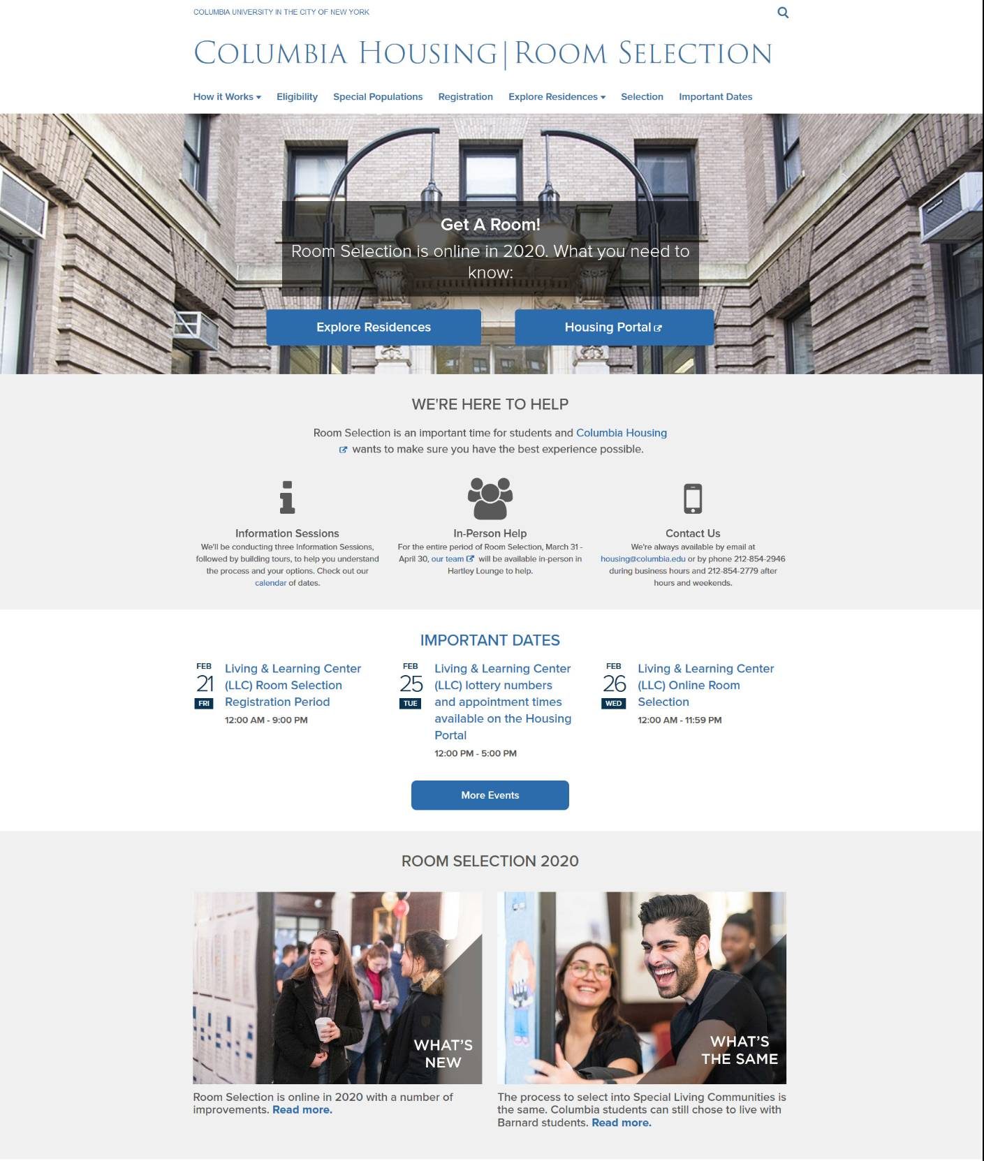
In any case, here it is. While it does looks nicer than the current page, it lacks the je ne sais quoi of the 2011 template. Nonetheless, things are more clearly located, be it information on residences or important registration dates. There’s even a new information video!
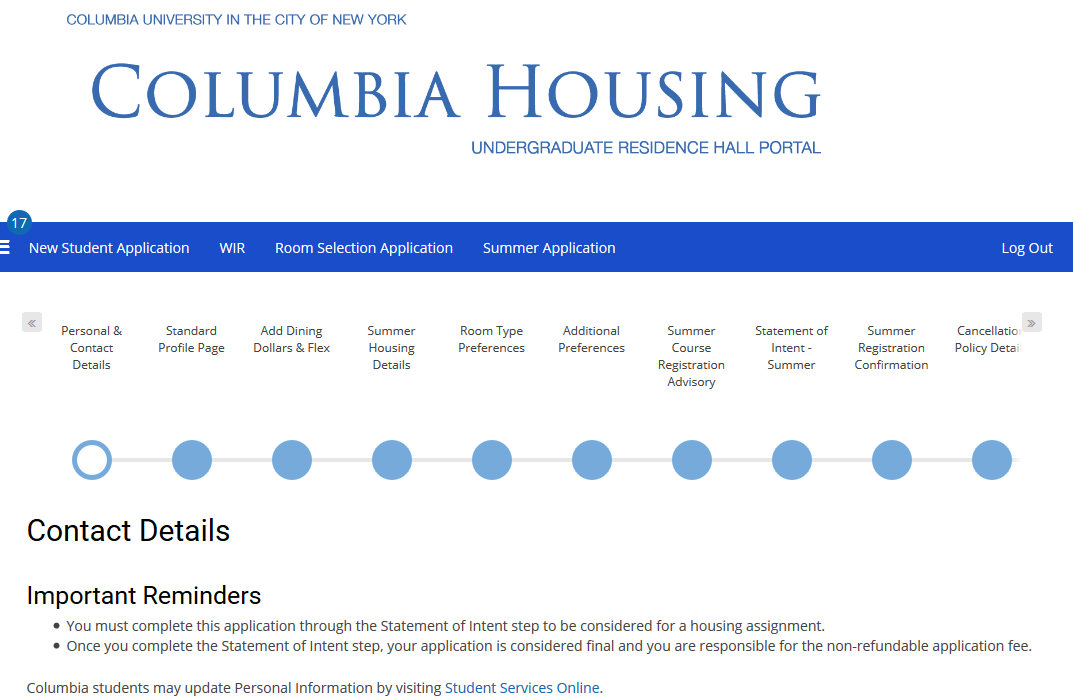
The website you should care about, though, is this one. It’s the functional equivalent of the old registration site — in fact, it is the old registration site, but with a new coat of CSS.
Here’s my proof: the real housing application’s not open yet, but the summer one is. See below for how that looks.

So, unless I’m missing something (and I likely am), housing’s the same process you know and love – just with different clothes on. It remains unclear just how moving selection online will change things, but I doubt it’ll be anything substantial. Per the new site, the old rules on lottery numbers remain the same, so you’ll probably just have an extra checkbox somewhere instead of having to walk to John Jay.
Oh, and by the way: these new sites are only for CC/SEAS students. Sorry, grad students – maybe some day the webmasters will stop using Adobe Flash.
Header via Bwogger


 0 Comments