(AKA my leaked GSAPP application.)
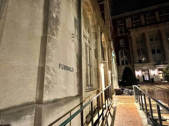
Not Deserving of Rank: Furnald + Various Building Sconces
These are gross. Despite my absolute disdain, I love her lack of energy. Go girl, give us nothing! Not even light! These sconces are also found outside of the entrance to the Dodge Gymnasium. While better suited outside the gym, these lighting features have neither character nor personality. Like you’d ask them their favorite comedian, and they’d say Seinfeld or something. Or you’d ask them what they like to do for fun, and they’d reply “listen to music” and give no detail about what artist because they just listen to white noise.

15. Carman Exterior Lighting
Plain. They feel like interior lighting that just happens to not be inside. These lights are proof of Carman’s hotelimbofication.
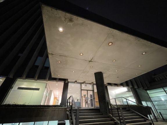
14. Law Library Entrance Lighting
Part of me is hurt to put this so low. The lighting complements the aesthetics of the law library’s architecture. This makes the lighting seem more successful and better than it actually is, but it is literally just ceiling lighting. They’re basically the same as the Carman exterior lighting except they fit in with their environment.
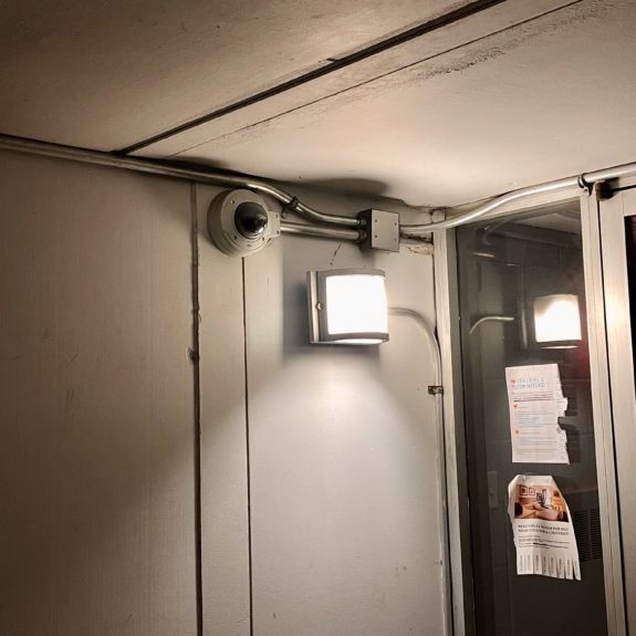
13. Random Generic Outdoor Lighting
They get the job done. Sometimes they’re in fun locations (like close to the ground)! Kind of give a weird underground bunker/survival camp energy.
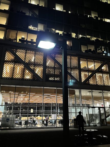
12. Pupin Plaza Streetlights
Who let LionCraft design these? (I love you LionCraft, you all seem really nice.) The blocky and quadrilateral nature of these street lights just seem a little too stereotypically engineering/STEM-y. It’s trying too hard. Despite their triteness, they do work well with the function of the surrounding buildings.
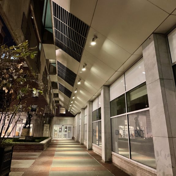
11. Mudd Overhang Lighting
Something about their shape is fun. They seem like they’re supposed to be for a studio and not to illuminate a walkway. The overhang creates a catwalk effect that is only amplified by the spotlight nature of these lights. When I’m walking under these lights, I feel like SEAS really stands for the School of Exquisiteness and Applied Sexiness. I believe it, if only for a second.

10. Earl Hall Posterior Globe Sconce
I appreciate how they evoke quintessential beaux-arts energy. I only discovered these a few days ago because their location is really out of the way, but I think they’re hidden gems.

9. Low Library Globe Sconces
The same as the Earl Hall Globe Lights but a little more intricate, so I appreciate them a little more. They add an ornate and refined feeling to their corner of campus.
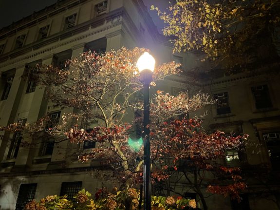
8. Regular Streetlamp
These are classic. When you think of a streetlight, this is probably what you imagine. The design is nice and effective, but it still finds a way to be elegant. They’re everywhere. My only critique is that Columbia does not have a consistent color light—some are a warm white and others are a cool white. It’s disorienting.
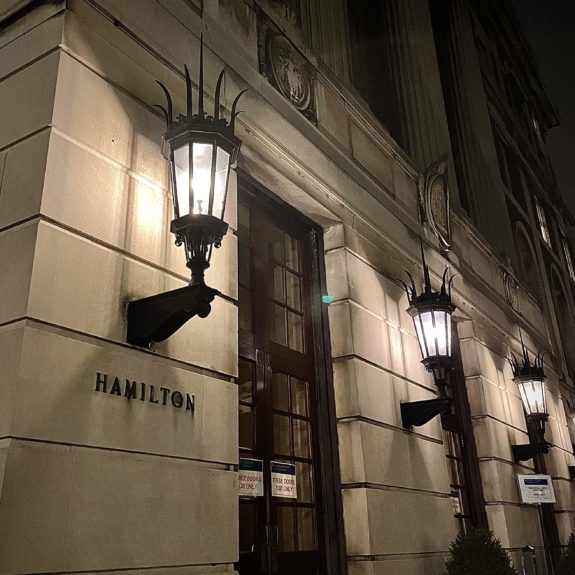
7. Hamilton-Pulitzer-Wallach-Hartley-John-Jay Exterior Lighting
Now, these? Gothic excellence. They’re dramatic and black iron (or something). They remind me of something you’d find on the campus of a grand cathedral or French monastery. And the cathedral or monastery was built on a hill that overlooks a city in the distance like Paris or Bordeaux or maybe just a small village in Normandy or Brittany. You might take a carriage into town some days—perhaps to fetch something from the apothecary—carrying your basket with a little piece of cloth over the top to hold your goods down. You always return home, back to the building in its grandeur. On those days that you go out, you return late, past the evening supper and into nighttime reflection. These lights are the lights that guide your way through the night.

6. Gate Lamps
The gate lights clinch this spot because of their support. The gate frames the lamp in a way that underscores both its power and grace. There’s also something to be said about how their location as an entrance or exit is a daunting task, yet they do it well. Seeing one of these helps bring you into the magical feel of the bubble of Columbia’s neoclassical architecture.

5. Butler Entrance Lighting
The last of the gothic lighting features on campus. Exactly the same reasoning as the Hamilton-Pulitzer-Wallach-Hartley-John-Jay Exterior Lighting but bigger and therefore more alluring. Perhaps you, the cathedral/monastery worker, are transferred to help the Bishop in the city and now roam the cobblestoned streets. These are the lights on the designated basilica minor. They have a subtle power in their posture.
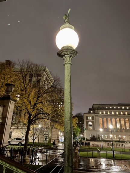
4. Globe Streetlights
From the bottom of a staircase to framing the door of a hall, you’ll find these streetlamps at the base or entrance of campus features. This marks them as more distinct and unique when compared to the Regular Street Lights. If the large central globe bulb and colorful body weren’t enough, many are capped off with a valiant soaring eagle. They’re pretty magnificent.
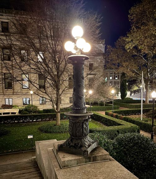
3. Earl Hall Lamps
These are classy. They have an intricate grapevine design on their body, and their light features are quite intricate. Somewhat reminds me of a pineapple! I think in time, they may rival the number one spot as they oxidize a little more. The color requires a little more focus to appreciate the beautiful design and intricate smithwork but these lamps are still gorgeous.
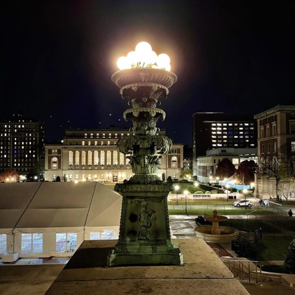
2. Low Step Lamp Posts
Wow. Beautifully semi-baroque. Complicated. A mystery for me to solve. The globe bunch nature harkens to the City Beautiful movement while the base is molded with intricate images and scenes. People on campus have rubbed one surface—a man’s booty—so much that it shines brassy amidst the sea of verdant copper.

1. St. Paul’s Chapel’s Lamp Posts
There’s something about their shade of patina teal that stole my heart. These lamp posts are vibrant but not exorbitant. They are aged but not decrepit. They’re ornate but not busy. Simply put, these lights are gorgeous. If you examine the fine craftsmanship, you’ll notice that the four faces carry a representation of the four Evangelists: Matthew, Mark, Luke, and John. This detail is confirmed by the presence of their attributed symbolic animal—Matthew with an angel, Mark with a lion, Luke with an ox, and John with an eagle. It’s a fitting detail, given their location. The lamp on the other side has features I am yet to decode but are equally gorgeous. I love them. They are perfect. They are the platonic ideal of a lighting feature.
All Lighting Feature Phots via Author


 0 Comments