 0 Comments
Deantini’s leaving, and he’s taking all the Pantone 292 with him!
Columbia’s colors are iconic. Sort of. That sky-blue color, Pantone 292, we all know so well—but the Columbia offices list Pantone 290 instead, both or either of which were first the colors of Columbia’s Philolexian Society. And, of course, the merchandise available in the bookstore, perhaps just to squeeze more money out of tourists, is available in royal blue, navy blue, and everything in between so long as it’s blue.
All that’s over now. Blue is out of style, out of touch, and besides. There’s an entire visual spectrum out there for us to draw from: why stay limited to just blue?

Purple’s sort of like blue. It’s a cool color, a combination of Columbia’s blue with a more fiery scarlet: the push of inspiration and rush of vigor which the students here need. Purple is the color of royalty—perfect for what was once King’s College. Purple is a striking color, but largely artificial, found rarely in nature—appealing to all the SEAS students chafing under the decidedly natural colors of the sea and sky. Especially as the cherry blossoms are blooming, what better time is there for a rebrand into a slicker, brighter Columbia, linked implicitly with artifice and great rulers?
Or maybe you think purple is a weak halfway ground between the current blue and a vibrant, bloody red, dripping with the sort of reinvigoration the university needs. Various advertising firms, who certainly have no vested interest in selling me things, claim that red is a “power” and “wow” color—wouldn’t you like to be walking to class every day, see a bright crimson Columbia flag flapping in the wind, and think “wow”? I know I would.
The other side of purple—blue combined with yellow, rather than red. If the unnaturalness of purple went out to all the SEAS kids, then a verdant, leafy emerald goes out to the environmental majors and everyone in CC reading Chakrabaty’s Four Theses for their last classes. Columbia has real budgetary and investment policies based around climate and climate research, but the only way to truly show that we care about the Earth is to slather the entire campus in green paint. There are no downsides to this plan.
If blue is right out, the only option is its compliment: orange! All year long, the campus would carry the sights (but probably not smells) of pumpkin spice—autumn in perpetuity. With all the fire of red, but combined with the bricky brown of Columbia’s buildings, orange is exactly the color no one on campus has asked for.
With so many options available, I think the decisions to be made are clear. Why stick with basic blue, when there’s a compendium of colors available for the taking?
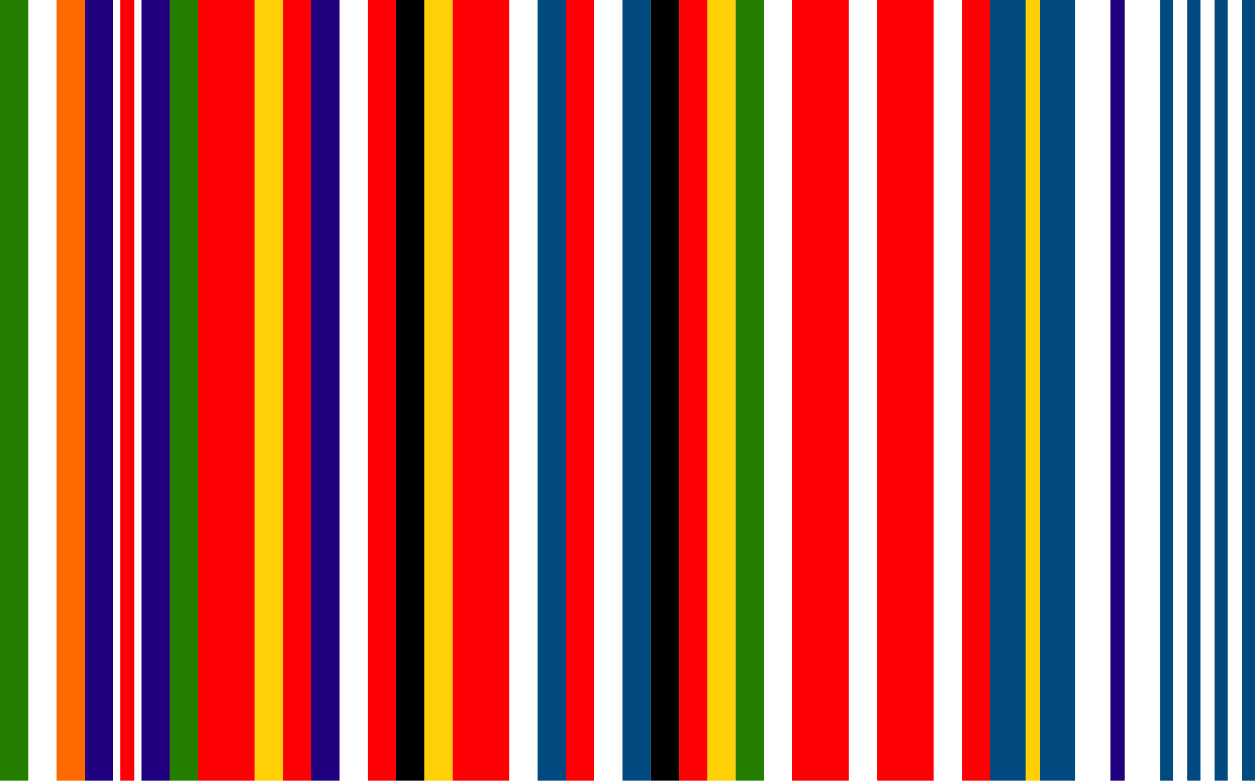
European “barcode” flag via Wikimedia Commons
Columbia logos via Columbia Web & Identity Guidelines
Eric Andre meme via Charlie Bonkowsky
