0 Comments
If you’ve visited Columbia’s Sexual Violence Response page lately, you might be as angry as we are about the quick escape button that doesn’t actually do the one job it’s been designed to do. Join our staff writer in the callout against the quick escape button– only an hour away by subway!
Content warning: discussion of sexual assault policy, and issues of sexual assault and gender-based sexual misconduct on campus.
On a student’s first days on campus, they immediately receive information about sexual violence resources at Columbia, mandatory reporters, and consent. This information is often both preceded and followed by online quizzes, portals, and videos surrounding what we learned at NSOP. With all these tech-savvy tools Columbia has given us to respond to and prevent sexual violence, you would think the Sexual Violence Response website would actually fucking work.
Basically, the first time you visit the website, you’re taken to the home page. The first thing you see is the staff directory, an interesting focal point, but that’s not even the focus of my criticisms. Then, you scroll down halfway through the page (about 2.5 finger scrolls on your trackpad) and see the QUICK ESCAPE BUTTON. By clicking it, you’re redirected to the Weather Channel’s website. The idea is, that no matter where a person is on the page, they should be able to quickly exit the site, so that if anybody walked in on them, they’d be able to pretend to be working on something else. This could be a wonderful, potentially life saving idea, if it actually fucking did its job. Columbia is trying to follow in the footsteps of many other domestic violence shelters, sexual assault hotlines, and women’s rights organizations with this button. The problem with this particular button though, is that it doesn’t actually redirect you. It just opens a new tab, so if I only had one tab on my computer, you would still be able to read Sexual Violence Response legibly after clicking the button. (In Columbia’s defense, I guess they assumed that college students never have only one tab open at a time.)
This isn’t even the worst thing about the quick escape button though. This button is supposed to be accessible no matter where you are on the site, but it is in the center of the home page. So, a person would have to be in that exact place on the website to be able to actually hit the button in time. What’s the likelihood that a person would be in that area if they were trying to find the resource they need? The staff page is more visible than this quick escape button, so I’m guessing there are people out there who have visited this website and don’t even know about this button.
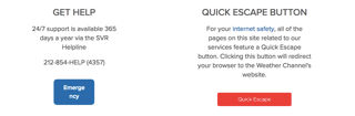
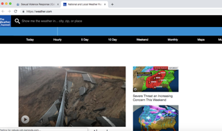
Not only is the button poorly located and executed, but it also takes you to the Weather Channel website. Does anybody use the Weather Channel website? Has a college student ever checked the weather on their computer? I have so many questions as to why the person who designed this feature chose the Weather Channel as the page to redirect to. Why not redirect to the Google search page? Columbia students study all the time. Isn’t Google more believable than the Weather Channel? Literally the only time I have used the Weather Channel on the computer is when I clicked the quick escape button on SVR’s home page to write this article.
SVR, please change the button. It seems like a fairly easy switch, but the fact that this button is so poorly done has larger implications. What does this button say about how we, as a community, care for sexual violence survivors? Based on this button, it says that we’re willing to put survivors in a compromising situation. This button not only puts survivors in dangerous situations, but it also further alienates those looking for resources and who wish to turn to Columbia to report or seek help after sexual violence. We know you’re trying, but please, for the love of God, try harder.
What a terrible design via Flickr and Columbia University.