0 Comments
On October 27, a Bwog Staff Writer attended the launch of an unprecedented digital map of New York populations in the mid-19th through early-20th centuries.
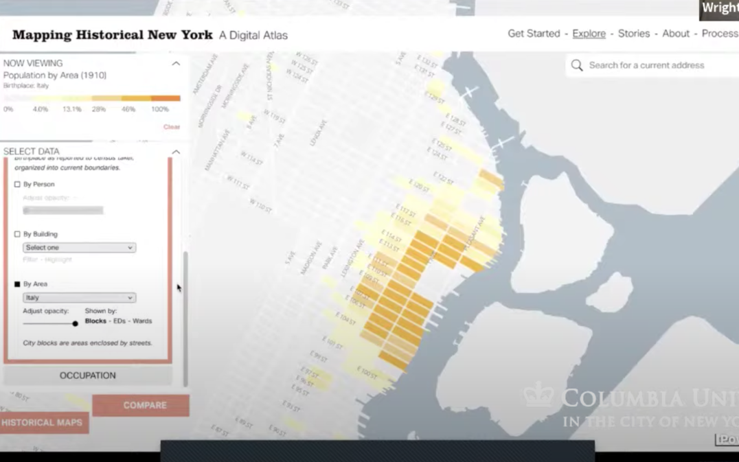
This Wednesday, the Center for Spatial Research, in collaboration with the Columbia History Department, launched a digital atlas titled “Mapping Historical New York.” Professor Laura Kurgan, Director of the Center for Spatial Research, opened the discussion by highlighting the future of spatial analysis in letting historians organize large amounts of data. The atlas uses GIS software to create interactive maps of Manhattan and Brooklyn, drawing on census data from 1850, 1880, and 1910. The work painstakingly focused on detail, locating each person counted in the census in their home addresses at a time when the street grid was not consistently established. This level of detail reveals the changes in demographics- race, nationality, gender, marital status, occupation- and land use during the 60-year period. As such, the map reflects the significant shifts in New York’s landscape during the period due to massive immigration and the inclusion of Brooklyn around 1890. Because databases before 1970 are often not widely available, the atlas provides an unprecedented visualization of the block-by-block makeup of late 19th century New York.
The project was inspired by the Hull-House map created by Jane Adams in Chicago, who went door to door interviewing the surrounding working-class immigrant neighborhood to compile a map of nationalities and wages. Unlike Jane Adams, the team for this project is separated from the neighborhood constituents by over a century. As such, reconstruction of the data required overcoming inconsistencies in street names and individuals, and parsing through data in the rural parts of the city with few records. The team used fuzzy matching algorithms to compare multiple maps and reconstruct missing data. Gergely Baics described this micro-level data as the future of social science and history; microdata makes the individual visible while revealing larger trends.
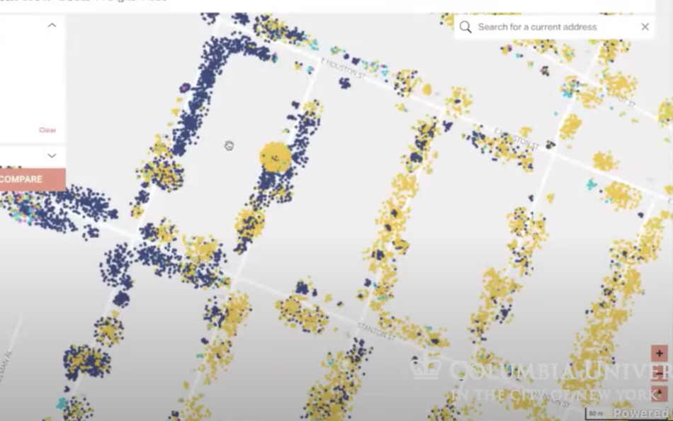
A key theme of the launch was accessibility. Although many comparable projects remain only in academic circles, the team intends the atlas to be used by a wide swath of the public. They highlighted its use not only in Columbia history classes, but in high school classrooms across the city. For example, Professor Rebecca Kobrin, who teaches a class on New York immigrants, explained how the maps challenge assumptions within her classroom that immigrant neighborhoods are insular, denying how closely interwoven they were with the wider New York fabric. Wright Kennedy provided an example of this, showing areas of overlap between Italian and Russian Jewish immigrants. However, the map’s individual-level data also showed that the groups were nonetheless segregated within buildings on the blocks.
The team further designed the project to be accessible for both academic and individual research. Wright Kennedy encouraged individuals to start by looking up the building they live in and exploring its history. In addition, they are finalizing public downloadable tables of data to further support wider use. They emphasized that the map is not a completed work of research, but a tool for further discovery. For example, mapping grade schools or other public services against racial distribution could reveal the relative accessibility of these services.
The map contains both case studies, from German enclaves to waterfront ports, and an explore tab that allows individual data interpretation. For instance, data on gender reveal that gender was not evenly distributed across the city. Rather, women were concentrated in upper-class areas of Manhattan because female domestic servants lived with these families. Because people often lived in places of production, home location and occupation were interconnected. The team also recommends switching between blocks, enumeration districts, and wards to reveal different patterns in the data.
Ultimately, “Mapping Historical New York” is the start of a wider project. The team received a grant from the Gardiner Foundation for another three years and plans to map all five boroughs, Nassau, and Suffolk from 1820 to 1940. This new data will reveal the impact on the city’s makeup of the newly freed Black population, as well as the great migrations from Puerto Rico and the American south. Ultimately, this expanded map will increase the amount of historical data accessible to educators and individuals interested in the city.
map screenshot via Catherine Beckett
Lower East Side screenshot via Catherine Beckett
East Harlem screenshot via Catherine Beckett