 1 Comments
We all see them plastering the walls, but have we ever stopped to really take them in? Bwog Staff Writers took to the streets (of Pupin) and gave their honest reviews on the flyers of campus.
We Bwoggers have recently taken note of the sheer variety and amount of flyers that dot this campus. Some seem to have been made on a Google Slide powered by pure will, while others showcase the talents of Barnumbia’s artists. We have taken it upon ourselves to provide our unsolicited opinions and advice.
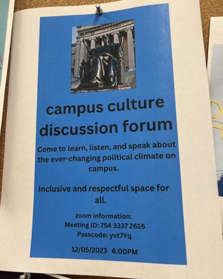
For such an important topic, this flyer left us profoundly disappointed. What happened with the margins here? The background has the aspect ratio of an iPhone photo. We get that they’re trying to be quirky with the all-lowercase, but this is advertising a conversation about campus culture, not a text to your roommate. Turn on auto-capitalization, please! The background color makes the text hard to read, which is especially important since there is no QR code for the Zoom link. Next time we’re browsing the flyers, we’ll remember to bring our pens and paper to copy down any Meeting IDs or important info!
Also, this photo of our girl Alma Mater evokes horror movie vibes. The slightly backlit lighting and grainy resolution make her seem more threatening than welcoming, the antithesis of the intent of the event it advertises.
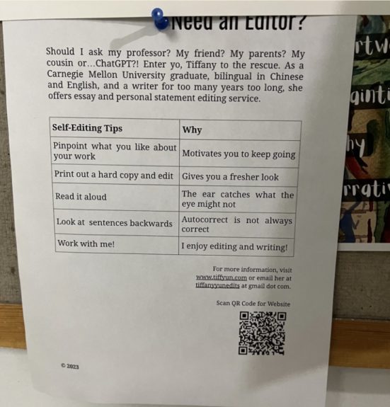
Personally, Tiffany, we’re not sure you’re the best editor. What do you mean you go from third person to first person and have sentences that look like they have double spaces?? And why is “website” capitalized at the bottom right?? And what makes you different, saying “I enjoy editing and writing!” Don’t we all, Tiffany. We think we can edit on our own, take a few steps back and also a few spaces back because you use too many.
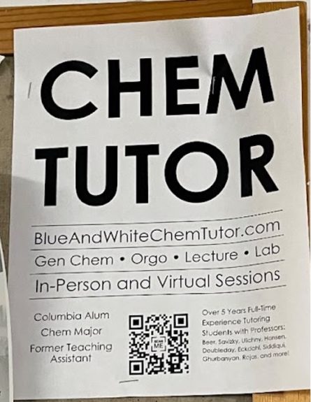
Guys… I think this one is about a chem tutor. We can confidently say we never walk by your flyer without noticing it. It’s clean and bold, albeit a little boring, but it gets the job done. Honestly, this is the definition of STEM-core. We admire the dedication to your craft.
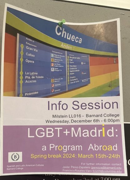
Look, we’re sure this trip is an amazing opportunity, and have so much respect for the organizers. But where are these yellow letters coming from? Perhaps they were inspired by that one “she’s broken / he’s ok” Tiktok trend. We spent way too long trying to figure out if they spelled out some cryptic message. Maybe the ‘i’ being 20pt font larger than the rest of the words is a clue… we’ll leave that to some Swifties to figure out…
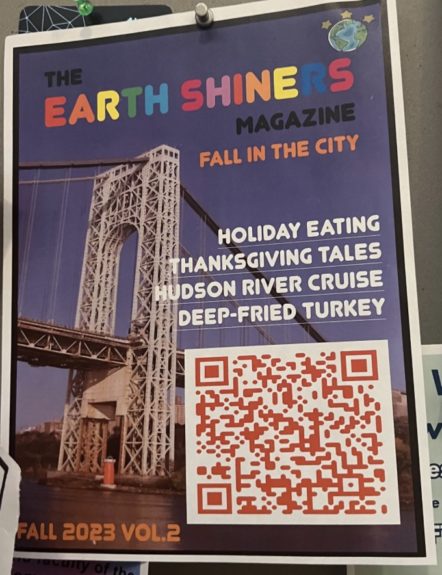
This is a very interesting one. Why is “Earth Shiners” in rainbow, and what is meant by Thanksgiving tales? Those of colonization and horrible things?? Is that why we’re using rainbow letters? To mask it? Because something is off. We get the vibe that if we show up, we will be put under mind control and/or enter a cult.
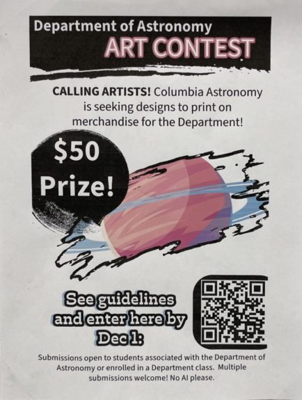
It’s for an art contest but why does it look like that? Not the most eye-catching poster we’ve seen, though we’ll give the astronomy department props because this might have been the first time they’ve touched something even close to non-Python computer programs. This poster also further emphasizes their need for outside artist support.
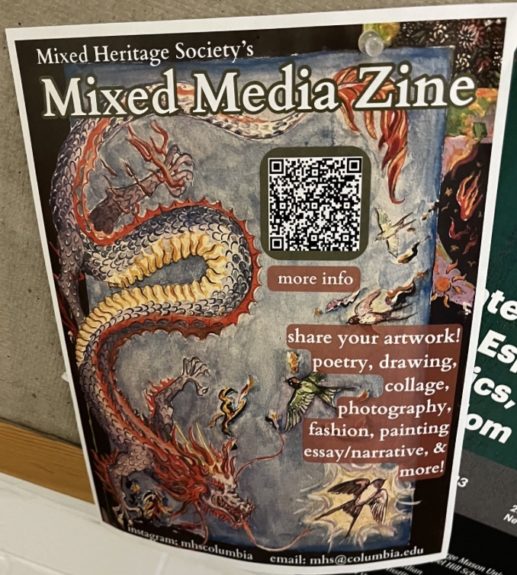
LOVE LOVE LOVE!!! This flyer is art in and of itself. The detail! The color! It wonderfully showcases the abilities and creativity of the designers!
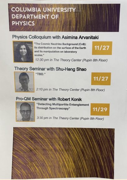
It looks like the color printer ran out of magenta ink. We’re also intrigued by the black and white profile photos in tandem with the color background. How did they pull off such a printing feat? Additionally, the inconsistency in detail of the seminar descriptions is puzzling. All we’re getting from Theory Seminar is “TBD.” We’d love to go to that.
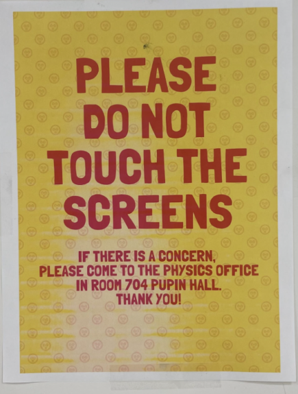
Upon first glance, we thought this was the *two hours later* Spongebob clip. There’s something about this font that evokes pineapple under the sea… This printer seems to also be running low on yellow ink. Perhaps there’s some sort of chronic ink shortage in Pupin. Additionally, we liked that the message is straightforward and that there is a reference for where we can take our complaints. But what is up with these emoji things in the back though, like why are they looking at us like this??
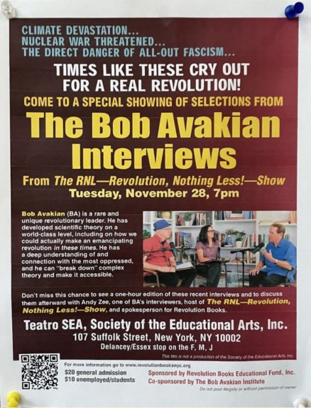
This is so millennial core, like 2016 makeup in a poster vibe. Basically, we mean outdated. Why is there so much going on? We don’t know what to look at or where to read and why does it even have directions to get there? We have GPS! Plus, very text heavy. Not sure if the yellow text and red gradient background speak to us. It’s giving: infomercial on a piece of paper, like when the guy with the mic talks extra fast about that one onion chopper mandolin gadget on cable TV for half an hour.
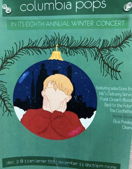
This is beauty. This is nostalgia. This is a work of art. This would have definitely tricked the robbers into thinking it was the real Kevin. We hope your concert went well!
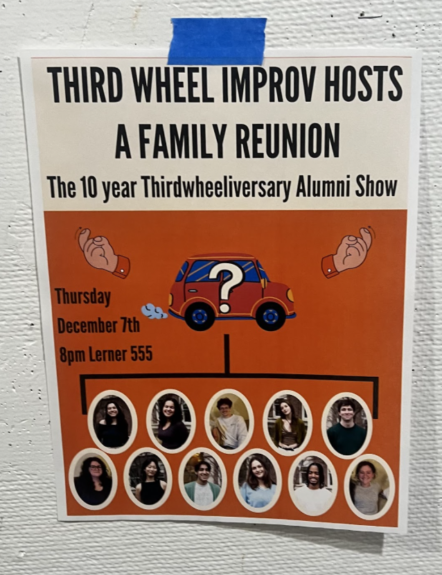
There’s a very cryptic message going on that we’re not sure we’ve been able to decipher. We see a family tree-esque branch, reminiscent of phylogenetic trees from bio. However, the beckoning hands emerging from the car gives similar vibes to a white van that pulls up on the side of the street and promises you candy.
Despite our criticisms, we still love you all, no matter what your flyer looks like. @Barnumbia students
All photos by Bwog Staff
1 Comment
@Anonymous AMAZING article! great and hilarious commentary!